How good UX design can improve conversion rates by Darin Brockman
In the web development business, we often talk about UX Design. Recently I’ve had clients looking somewhat bemused (seemingly bored) when I’ve been talking about UX design. In my quest to educate, I thought I would give an overview of UX design and why it’s so important to get right when selling direct and how it can increase conversion rates.
UX stands for ‘User Experience’ and was coined by Don Norman when working as the vice president of technology at Apple in the 1990’s.
Norman explained the origin of UX in the following quote:
‘I invented the term because I thought Human Interface and usability were too narrow: I wanted to cover all aspects of the person’s experience with a system, including industrial design, graphics, the interface, the physical interaction, and the manual. Since then, the term has spread widely, so much so that it is starting to lose its meaning.’
Norman, in a recent essay, highlighted the combination of ingredients that go into a high-quality User Experience:
‘The first requirement for an exemplary user experience is to meet the exact needs of the customer, without fuss or bother. Next comes simplicity and elegance that produce products that are a joy to own, a joy to use. True user experience goes far beyond giving customers what they say they want, or providing checklist features. In order to achieve high-quality user experience in a company’s offerings there must be a seamless merging of the services of multiple disciplines, including engineering, marketing, graphical and industrial design, and interface design.’
Although UX relates to both physical and digital products, my focus is around websites, specifically e-commerce and direct selling and how we apply the principles of exemplary UX design to that discipline.
Websites are becoming increasingly more complex, as technologies and methodologies advance they have evolved to offer a rich and interactive experience. There is a temptation to cram as many features as possible to enrich the user experience. However, the success of a website still revolves around how users perceive it. Is it easy to use? Was it a pleasant experience? Did they find what they wanted? Did the pages load quickly? Was the purchase process quick and easy? My advice to clients is keep their primary objective for their website front of mind, to use restraint and not to get distracted by all the bells and whistles that will ultimately distract users from finding what they’re looking for quickly and easily.
If the primary objective is to sell books from your website, make sure that this is the most visible element on any landing page. Your company twitter feed, blog or social share buttons at the top of a page will only distract the user from finding what they came to the website for in the first place.
So, what does this mean to a publisher? We hear a lot about content being the most important element of a website, or that ‘content is king’ but I’d suggest that ‘engagement is king’ and that’s where good UX design comes into play. The way that content is used and displayed must have a direct relationship and reinforce the objective of the website.
For example, in the case of an e-commerce website, content should be used strategically to engage users and drive them to click on the buy button. A chapter sampler that opens as a pop up or a video that plays in page, rather than taking your user off to another site, a well-timed pop up with a special offer, will ensure a far happier user experience.
Why is this so important? Unfriendly UX causes high bounce rates, lower site traffic and less sales, so let’s take a look at the two main areas where improving your UX will have a positive effect on how users perceive your website.
Speed-up your website
We’ve all been there. You need something fast–an address, the birthday present you were supposed to order yesterday, that news story you need to read before a meeting. After a quick search, you click the link, then you wait… The images are slow to load, the ads loading freeze the screen, then when the site loads you get that annoying pop up asking if you want to register for the monthly newsletter. Frustrated you click the back button in hope of finding another site that can give you what you want quickly.
Slow load times are one of the biggest UX issues users complain about and the biggest contributor towards high bounce rates (or lost customers). It’s important to consider how long your site takes to load a page, ensure that you limit large images, bad (bloated) HTML, social sharing buttons, adverts and, most importantly, get your hosting environment right.
Ideally if you’re serious about selling online you should adopt a dedicated server, whilst not always cost effective for sites with low sales, opting for a dedicated server can have a huge impact on conversion. Speeding up your site’s load times can have a dramatic effect on increasing sales as Kissmetric’s infographic demonstrates.
Here is a handy checklist, courtesy of eConsultancy’s Patricio Robles, of the top 20 things attributed to slowing down websites:
| Social sharing buttons | Header fail |
| Ad network code | Forgetting to Gzip it up |
| Analytics tags | Poorly-written server side code |
| JavaScript-based functionality | SQL queries from hell |
| Unoptimized images | Old versions of server-side software |
| Bloated HTML | The wrong web server |
| CSS (crappy stylesheets) | Flash and Java |
| Amateur jQuery | Shared web hosts |
| Subpar DNS | Public networks for private data transfer |
| Too many domains | Inefficient server-side caching |
Optimise for mobile and improving checkout
Apart from the obvious difference of the screen size, the main difference between using a desktop and a mobile or tablet device is how the user navigates your site. Whilst this is changing with the advent of touch screens, desktop users use a mouse to navigate whilst on mobile and tablet they use touch. According to research undertaken by UX matters, the way users hold their phones also impacts on the user experience. It found users hold their phone in three basic ways whilst touching the screen or buttons: 49% were one handed users, whilst 39% cradle their phone and only 16% use two hands. How users hold their phone is also constantly changing depending on the tasks they are performing.
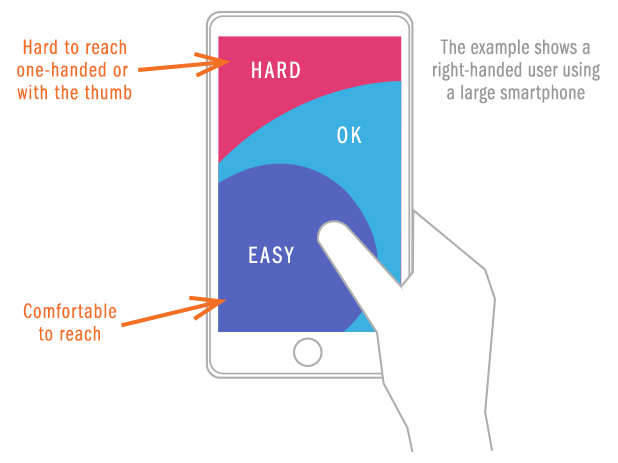
However, regardless of how users interact with a phone the thumb plays an active role in the interaction of a website. When designing for mobile, one critical factor to consider is where you place key elements in relation to easy to reach areas of the screen.

As the image above shows, when looking at your checkout pages on a mobile you need to place all the important elements in the easy and ok areas to ensure you are offering the optimal user experience. Text input fields need to be kept to a minimum and break the checkout into multiple pages remembering that the screen keyboard is likely to take up a half of the screen.
Once again, the speed of the checkout process has a big impact on conversion. Consider the following:
- Remove any unnecessary images or scripting elements such as carousals
- Necessary graphics such as logos etc, should be CDN (Content Delivery Network) hosted, this essentially acts as caching to a local server
- Remove all third-party scripts from the checkout such as social media buttons
My top tips for a seamless and user friendly checkout process are:
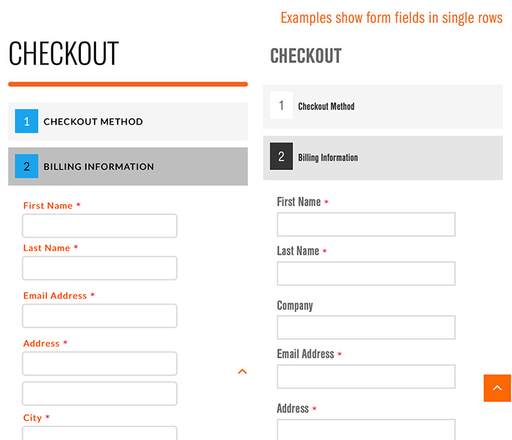
- Avoid placing two or more fields in a single row (see examples below)
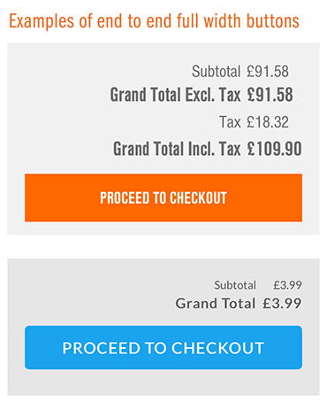
- Provide wide buttons, typically end to end full width (again see examples below)
- Include a guest checkout option
- List a telephone number (click to call)
- Avoid links out of checkout
- Offer express checkout and PayPal
- Store items in basket (persistent checkout)


This infographic serves as a timely reminder why you should not ignore mobile optimization. You could risk losing 79% of users if your mobile site isn’t optimised. Ignore it at your peril.
Darin Brockman is Firsty Group’s CEO and Founder.


